Riffing on design

During my heady student days, I spent most of my time (and student loan) travelling up and down the country playing guitar in a pop-punk band. Rather than attending lectures, I thought my time would be better spent writing hook-laden pop rock.
I never found songwriting easy, as I was always in pursuit of the ultimate guitar riff. You know — the ones that cut straight to the chase, get your head nodding, and burrow deep into your brain, remaining there for days. I found the simplest, most awesome guitar riffs are also the most difficult to achieve.
And it’s the same thing with design.
Many products I use are devoid of hooks — elements which distinguish them from the next product or experience. Making a simple, more unique product experience is also a difficult thing to achieve.
But designers from all disciplines can draw inspiration from the world of making awesome guitar riffs to rethink creating great brand experiences for products.
Before we’re ready to jam, let’s set the stage properly.
SETTING THE STAGE:
Genre
The type of product or industry you are designing for can be an influential factor when getting ready to start designing.
What feels appropriate for the genre you are designing for? Don’t feel like genre is a straitjacket that defines what you can or can’t design. Some of the best guitar riffs re-define genres, but you have to be willing to push the boundaries a little.
Equipment
Once you know the genre you are designing for, you can use this to inform your choice of equipment.
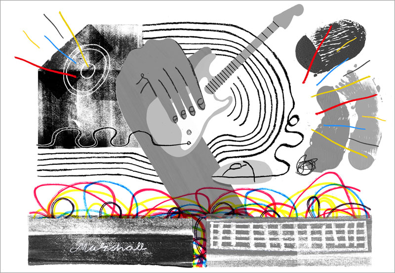
So for me in my pop-punk band days, my equipment was a Fender Stratocastor guitar paired with a JCM 900 Marshall stack amplifier. This was to get the distortion sound I felt matched the genre. I had a simple set-up — no chorus effects or delay pedals; clean and distortion channels were the sounds at my disposal.
For design: think about the right tools for this particular job — equipment that suits your genre and helps you to do the best work you can.
The equipment you choose doesn’t have to be set in stone just yet, but they should act as a starting point that you can refine once you start jamming.
Lyrics and Audience
I used to be take inspiration from our singers’ lyrics when we were writing songs. I’d read through them to understand the themes and tone of the narrative, then use them to try and evoke different feelings in our audience through chord progressions or choice of notes.
Applying this metaphor to design: you’ve got lyrics, which is the content you are using to design from. And you should also have a good idea of your audience too.
The jam session
The stage is set and your equipment is plugged in ready to go. You’ve got your content, users in mind and your head is in the right genre. The time has come to jam.
Let’s breakdown what I feel makes an awesome guitar riff:
- 1. They begin a song
- 2. Get repeated throughout
- 3. Give a song its distinctiveness
- 4. The simpler, the better
Therefore, design riffs are simple repeatable elements in a product experience that hook the user from the get-go, giving a product its distinctiveness.
There are so many elements to play with to enhance your design riffs. But it’s about how you bring them together to make an overall effective design.
THINK ABOUT:
Moving through keys: Going from major to minor can shift the atmosphere of a riff entirely. How might you invoke that same feeling in a design riff?
Time signatures: Especially unexpected time signatures can be stand-out moments in guitar riffs; in design riffs these could be your high and low points. An intriguing wash of colour to attract attention or imbue meaning can be used to great effect.
Borrow from other genres: A tried and tested method in awesome guitar riffs is to build on ideas used in other genres. What other industry verticals or areas could you look to to inspire interesting hooks or elements for your design?
Taking it a step further
Signature interactions: Much like Black Sabbath guitarist Tony Iommi developed a distinct hammering style (partly due to an industrial accident causing the loss of two finger tips). When wielded responsibly, a signature interaction can stamp your brand onto meaningful interactions a user has when using your product.
Avoid being generic
Musical genres have their formulas and overly-familiar structures, much the same as we as designers have invented our own industry tropes.
Product designers are living in a vacuum: using the same tools and copying each other without a second thought for context or appropriateness.
We should be taking a leaf out of The Kinks guitarist Dave Davies’ book and looking closer at the tools we use to design with.
To counter the mainstream, clean guitar sound of the 1960s, Davies slashed the speaker cone of his guitar amp when it wasn’t creating the expressive tones he was searching for. In this act of anger, Davies changed the course of the guitar tone forever — introducing distortion to the aural palette.
Instead of conforming to the norm and allowing his tools to dictate his sound, he altered them to create an entirely new one.
Consider your choice of design tools and question if they are controlling the kind of styles you can fully explore.
Next time you are starting the design of a new product or re-designing an existing one – consider your genre, equipment, content and audience. Take cues from the world of awesome guitar riffs to craft an experience that expertly uses key changes, time signatures or signature interactions. And use them to elevate what could become another boring product experience to one that sets itself apart from the crowd.
CREDITS:
Made by Many is a new type of consulting company that brings together product design, business strategy and software engineering as a unified discipline. For 10 years we’ve been helping forward-looking companies to re-imagine their customer experiences, create new models for growth and build new capabilities. See our work.
Adam Morris is design lead at Made by Many. Through the use of visual and interaction design, he continually balances customer needs with business requirements. Morris believes in user-centred design, rapidly testing assumptions early and often to help bring new digital products to market. He can be found tweeting at @adamorrisdesign.
Originally published at madebymany.com.
Illustrations by Sam Russell Walker.


