Anatomy of a Sell Sheet: A Deep Dive… What is it? Why use it? Who needs it?
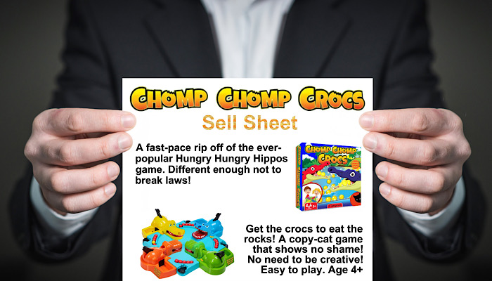
Of all the topics that baffle new inventors, the subject of sell sheets seems to be the one that most often creates total inertia. Why? Because there’s precious little info available on them. Professional inventors rarely share them, there’re few examples to be found online… And some people in the industry actively discourage their use!
That’s why this deep dive into the subject comes in two parts. First I’ll explain what they are, what they do and what they might look like. Then Billy Langsworthy will ask a number of inventors – and inventor relations execs – whether they’re for or against the sell sheet, and what they like to see. So! Let’s start, as Julie Andrews so quaintly put it, at the very beginning…
What IS a Sell Sheet?
Also known as a ‘one page’, a sell sheet is – in the simplest terms – a physical version of an ‘elevator pitch’. That’s it! So let’s say your elevator pitch for a family board game was something like this:
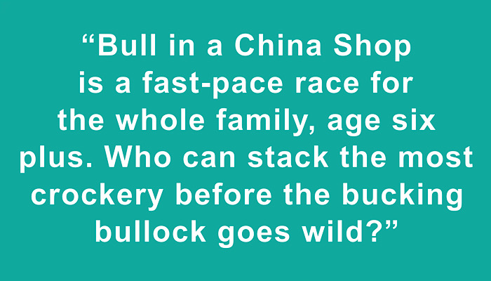
Your sell sheet would be a piece of paper – possibly laminated – with THAT written on it. There’d also be a few decent images, and some details about the number and age of players or users. If it’s a game, you might also include how long it takes to play. You can show those three things as icons if you like – just the sides of most game boxes do. Finally, there’d be a call to action of sorts – and, of course, your contact details.
Who Uses Sell Sheets?
Most inventors… And some inventor relations executives. To be clear: not everyone who works in inventor relations WANTS a sell sheet. Some people consider them old-fashioned and redundant in the wake of sizzle videos. But many others still swear by them. That being the case, it’s fair to say inventors still need sell sheets. Why? Very simple… It’s better to have a sell sheet and not need one than to need a sell sheet and not have one.
Layout
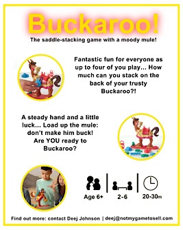
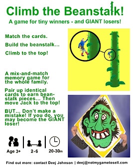
I’ve spoken to a number of aspiring inventors about their not creating these sheets. One of the biggest hurdles to their progress seems to be that they don’t know how to lay one out. The fact that there ISN’T a standard sell-sheet format only seems to add to the problem. In truth, though, the layout really doesn’t matter. The crude example I’ve mocked up at the bottom of the page shows how simple things can be.
What to Put In
Believe it or not, you really need just three things on a sell sheet. Specifically…
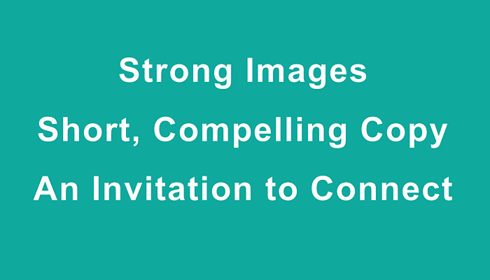
Let’s quickly go through each of those. Before I do, I’ll stress that the key to sell sheets is brevity. They’re supposed to sum up an idea. Keep them short, keep them clear.
Strong Images
You know what they say about a picture being worth a thousand words? If anything that’s a conservative estimate! You’ll grab far more attention with one clear image that you’ll get with any number of words. In fact, most people find great chunks of text hugely off putting.
This is why the images you choose should communicate – if possible – the most interesting element of your idea. They should also put over its tone. For example, if you have board game that’s outrageously adult in nature, I would expect to see at least one photo of players looking shocked or embarrassed. In short, you shouldn’t tell people what your idea is if you can show them.
Short, Compelling Copy
Some of the sell sheets I’ve seen, particularly for tabletop games, have acres of wording – often in the tiniest font. In those instances the inventor has clearly fallen into the trap of trying to communicate as many thoughts and emotions as they can. But a sell sheet is not the place to do that! It needs concise, easy-to-read copy. What’s more, my suggestion is that you don’t focus too much on the features of the game so much as the feel and energy.
By way of example, here are two pieces of copy that describe the classic Hasbro game Buckaroo. The first description focuses on facts and features. The second pays attention to the energy and feel.
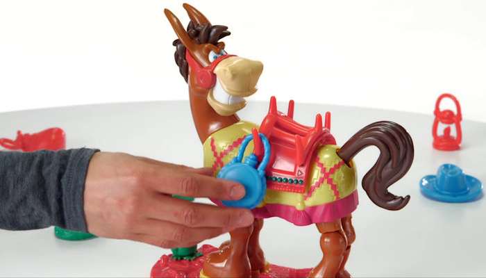
Buckaroo – Facts and Features:
A game of balance and dexterity for between two and four people.
Players compete to carefully hang numerous objects on a plastic donkey.
Whoever hangs the last piece before it kicks – and sheds its load – wins. Three skill levels. Complete with 12 accessories. Measures 22 x 85 x 23cm.
Buckaroo – Energy and Feel:
The saddle-stacking game with a moody mule!
Fantastic fun for everyone as up to four of you play…
How much can you stack on the back of your trusty Buckaroo?!
A steady hand and a little luck… Load up the mule:
don’t make him buck! Are YOU ready to Buckaroo?
I’m sure you can feel the difference between those two pieces of copy. They’re both around 50 words long, but the second piece communicates far more about playing the game. Next to the visuals, that little peppering of copy is probably enough.
An Invitation to Connect
Part of my background is in scriptwriting for video production. Indeed, I’ve now lost count of the number of times I’ve written a script to communicate something… Scripts about charities, businesses, events, products, services and information of every kind!
For every single one of those videos, I’ve been adamant with clients… If the script doesn’t invite someone to DO something at the end, then there’s little point in making the piece!
This is also true with sell sheets. What’s the point in making your idea look and sound brilliant if you leave off your contact details? And what’s the point in putting your contact details in if you don’t invite someone to use them?
This is not to say that you have to be over salesy. Plenty of inventors shy away from a crass call to action – “Buy it while you can!” – in favour of a simple invitation to connect:
What to Leave Out
Opinions differ on this, but I advise against including full gameplay details. I also advise against putting in the full rules and a detailed inventor biography. My suggestion is that you think of your sell sheet as being like the headline in a newspaper story… You just want a “This is the gist!” headline; an overview. If your idea wins attention, then they’ll be plenty of opportunities to communicate more information.
Variations
In the toy and game industry, sell sheets tend to focus on products… One sell sheet for each idea you’re pitching. In other industries, it’s not unheard of to have sell sheets that pitch services and even companies. For this article, I’ve focused the attention on products. The advice is largely transferable, however.
Putting it Together
Here’s how I might lay out the three pieces of copy you saw earlier, alongside some images. Remember: There’s no right or wrong way to do the layout! Just be sure to stick to those three content needs:
Strong Images
Short, Compelling Copy
An Invitation to Connect
Sample Sell Sheet
Obviously, I’m using Buckaroo purely as an example… Only an idiot would make the mistake of thinking that I claim any rights over this game! It is and remains the property of Hasbro.
