Art of Asmodee: Days of Wonder’s Cyrille Daujean talks Ticket to Ride and the ‘seduction’ of great game visuals
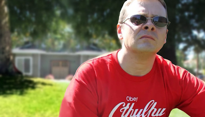
Our new Art of Asmodee series looks at how the various studios within Asmodee tackle art direction for their games.
First up is Days of Wonder, the powerhouse studio behind hits like Small World, Memoir 44 and the blockbuster Ticket to Ride series.
We caught with up with Cyrille Daujean, art director at Days of Wonder, to learn more about how the studio seeks out new artists to work with and what drives the style choices behind Ticket to Ride.
Hi Cyrille – so first off, how did you get started in the tabletop space?
Role-playing is what started it all. Back in 1992 I dropped out of the University of Art in France one year before my Master’s graduation to join some friends who had just founded a role-playing game publishing company called Multisim. We were all role-game players, of course, but we were also fond of board and video games. We published a role-playing game about contemporary occult called Nephilim, which was well-received in France.
In 1995, we had the opportunity to localise, in French, a game from Chaosium called Credo. We completely redone the artwork and components and that was the first board game I ever worked on. I have good memories; the game was excellent, irreverent and very fun. The illustrations were made by a friend from my university years called Julien Delval, who would go on to do the art for Ticket to Ride years later.
After this project, we signed a game by Bruno Faidutti called Murder at the Abbey, which was re-published by Days of Wonder years later under the name of Mystery at the Abbey.
The third game I worked on as art director was Bruno Faidutti’s Citadels. From the Noughties, I started to specialise in board games, while continuing to work on collectible card game graphic design, role-playing games as writer and art director, book publishing and as a designer in video games.
Days of Wonder has worked with lots of different illustrators over the years – what guides your approach to working with artists?
For me, game mechanics are the core of a board game, but visuals like artwork and graphic design are also very important.
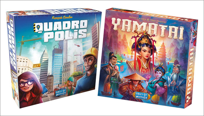
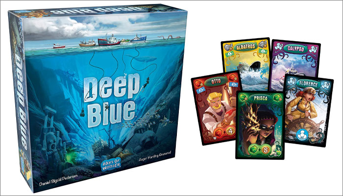
The first thing a player sees is the box. Visuals allow them to identify what the game is about, which then pushes them to think about what it looks like inside. It brings out the theme by seducing the player through art. This moment of ‘seduction’ is important, because in a game shop, there are hundreds of boxes side by side trying to catch your eye.
Logically, you buy a game to play with and just being gorgeous is not enough to make a good game. Once you’ve been caught by the art of a box, the mechanics of the game take over, but art and graphic design have a role to play in the gaming experience. Art carries the theme while graphic design serves mechanics and guarantees fluid and smooth gameplay.
It is a balanced synthesis of art and graphic design at the service of game mechanics that make very good games.
When you’re aiming to nail that balance, do you often have artists in mind for projects right from the get-go, or is it a case that lots of illustrators can pitch for the work?
When a game reaches a certain maturity in the development of its mechanisms, we position it into market archetypes. We know if the game is simple, easy and for casual gamers, or if it’s complex, time-consuming and aimed at ‘serious gamers.’ All this gives clues as to the visuals and universe that we could make mechanics live within.
All these reflections lead to a point where we can define three pillars to start the production of a game: its mechanics, its universe and its register. The mechanics is the main system driving the game; be it bluff, deck-building, worker-placement, and what the weight of the game is. The universe is what defines the context, like science fiction, realistic or abstract. The register is the tone we’re looking to evolve: dark, dramatic, light, caricatured, realistic… those kinds of things.
We then imagine which artist could be comfortable in this universe and take enough pleasure working on the project for it to sublimate his work.
Great, and how specific are the briefs you usually give?
In general, I try to leave a lot of freedom to the artists with whom I collaborate.
Obviously, we have a very defined framework with a theme, and guidelines, but I want the artists to visually appropriate the universe as much as possible and give the maximum added value to the game through their creativity and talent.
Being too directive does not seem to be the best way to get the best out of an artist, in my opinion. And by ‘best’, I mean the most surprising, creative outcome. Of course, I sometimes come back to very framed – and restrictive – prescriptions if we can’t agree, but that’s very rare.
And is anyone off the menu when looking for art partners, or do budding artists have as much chance as some of the more experienced illustrators?
Personally, there are two types of collaborations that I really appreciate.
The first is to work with junior artists who know little about board games. This is an opportunity to work with people who have a fresh eye, which allows for growth for both the illustrator and I.
The second is to work with experienced veterans who have been locked up in a specific style over time. Publishers who try to control their risks as much as possible tend to ask artists to stick to their “personal style”, but I like giving them an opportunity to escape their usual routine.
It’s great to hear you like working with junior artists – you may be flooded with requests after this goes out! But where do you go to find great new artists for your games?
I don’t have a specific place to find great artists. I monitor several websites where artists post their work and have galleries. I try to look at books when I go to gaming conventions, and I always check online websites from artists who contact me by email.
I remain curious about everything; noting names of artists from comic books, art books and video games.
For dedicated sites, I have often tried to contact artists using their professional pages, but it’s very rare to receive replies from them.
How strange – you’d think they’d jump at the chance!
Yes, it’s disappointing to see that ‘pros’ don’t even bother to answer you when you offer them a possible collaboration. Maybe I’m just unlucky!
Is there any attempt to create a Days of Wonder style that spans all your games? Or it the art direction done on a purely a game-by-game basis?
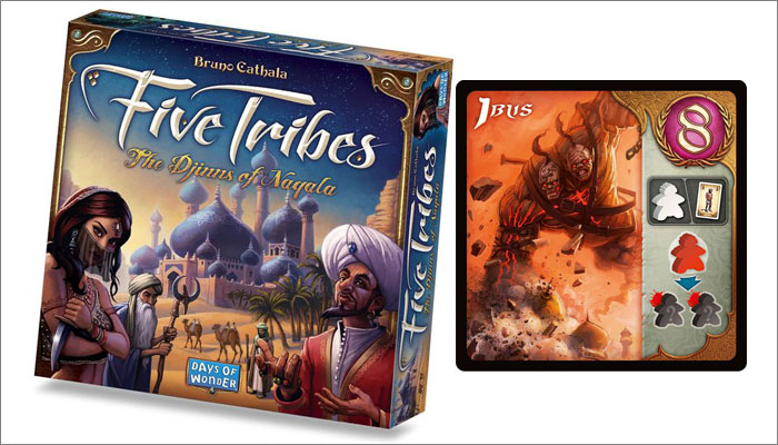
For Days of Wonder, there is a strong guideline to give a coherence between the different published games. Even if the worlds change radically from one game to another and the artists are different, the general art direction must maintain a common red line between the games.
To make it simple: we try to give them a family resemblance. However, we have also given ourselves scope for a little experimentation in recent times.
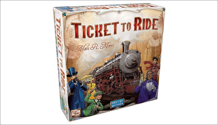
Let’s delve into one of your big brands – Ticket to Ride. Julien Delval illustrated the first game and has since been involved with almost every other version and expansion. What made Julien a perfect fit for that first Ticket to Ride game?
As I said, I have known and worked professionally with Julien Delval from the very beginning of my career. He is a skilled artist with a strong personal style and universe. He is also a close friend and a truly good person.
The reason Days of Wonder originally chose to work with him was due to the background we wanted to install in Ticket to Ride. From the start, we wanted the game to be engaging for all members of a family, from kids to elders.
We decided to go in a deliberately traditional, soft, cosy style with an artisanal technical register – gouache, watercolour, pencils… Julien was the ideal artist for this mission.
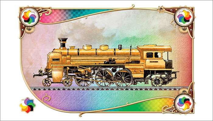
We are particularly happy to have some of our games illustrated by an artist who does not work entirely on a computer. This gives a comfortable, reassuring atmosphere which can be felt when playing the Ticket to Ride series.
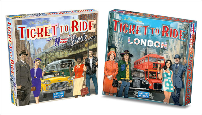
Our choice was validated by the success of the very first Ticket to Ride. We decided to maintain this direction over time, and kept collaborating with Julien for all the derivative versions of this original lineage of the game. After more than twenty games, the range is visually pleasant, consistent and we like it as much as it seems to appeal to players.
For any artists or illustrators reading this and thinking ‘I’d love to work with these guys!’, what would you say is key to creating artwork for a Days of Wonder game?
That’s a tough one! An interesting artist is someone who has a personal style, but enough talent and technique to alter it according to the “tone” that the publisher wishes to give a game.
In the case of a board game, we must constantly keep in mind that most of the artwork and graphic design is here to serve the game mechanics. The board game space is not suitable for artists who put their creations and their personal expression above the medium. One could say that a good artist for board games knows they are also an artisan.
They also need to be creative, flexible, and capable of proposing leads while accepting the fact that they could be refused.
Finally – and this probably applies to most of the jobs in the world – but they need to be reliable and responsive. You can be full of talent, but if you are not able to meet deadlines, it is better to express your art where timelines do not matter.
And for me, it also needs to be someone who replies to my emails when I offer a collaboration, even to say “No thanks!”
Well let’s hope your luck changes in that regard soon! A huge thanks again for doing this Cyrille, it’s been a real eye-opener.
—-
To stay in the loop with the latest news, interviews and features from the world of toy and game design, sign up to our weekly newsletter here


