Art of Asmodee: Lookout’s Klemens Franz on what drives the ‘non-intimidating’ look of games like Agricola, Bärenpark and Grand Austria Hotel
Our Art of Asmodee series looks at how the various studios within Asmodee tackle art direction for their games.
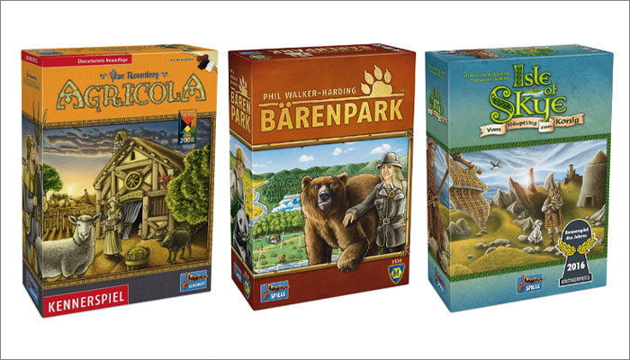
Today, we’re catching up with Lookout Games, the studio behind Agricola, as well as other beloved tabletop titles like Bärenpark, Patchwork and the Kennerspiel des Jahres-winning Isle of Skye.
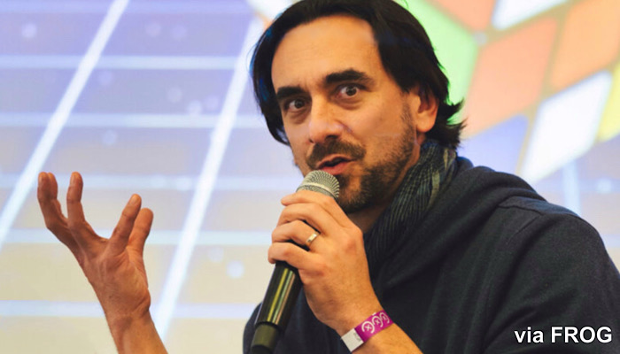
We caught up with Klemens Franz, who acts as both art director and featured artist at Lookout, to find out more about the role great art plays in the success of the studio’s games.
Klemens, you’ve handled the artwork for lots of much-loved tabletop games, but how did you get started in this industry?
By accident! I participated in a small illustration competition from Lookout. My drawing got selected, I met with Hanno Girke from Lookout during Spiel in Essen and he asked me to provide some scribbles for a game they planned to do. One year later, Agricola was released!
How key a role does the artwork play when it comes to the success of a game?
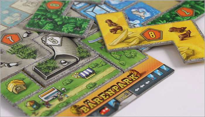
Well, it can really destroy a good game! On the other hand, it can make a game more atmospheric and, more importantly, easier to handle. The flow of information, the clarity of icons – call it UX design if you want – all those aspects are really important.
But great art or graphic design can never make a ‘not-so-good’ game great. It’ll probably make it a little bit better, but the game and its system are what makes up most of the experience. Art shouldn’t get in the way; it should enable and make the handling of the game easier.
What guides your approach to working with external artists? Do you often have someone in mind for projects, or can artists can pitch for the work?
In most cases, we chose the artists. We know how we want the game to look and based on that, we select the most appropriate artist. An important aspect is knowing that the workflow will be smooth, so coming back to artists we’ve already worked with is common.
We also always try to take into consideration suggestions by the designers. They sometimes want to work with specific artists and if we can make that possible, that’s a great thing.
Where do you go to find great new artists for your games?
There are many sources, but I do have a mail folder where all applications from illustrators go to. And even though I do not always find the time to answer every one, I go through those emails when we look for something or someone new.
Is there any attempt to create a ‘Lookout’ style that spans all your games? Or is the art direction done on a purely a game-by-game basis?
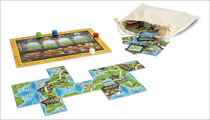
That’s a tricky question. I have worked for Lookout since 2006 and have illustrated most of their games. That means the look-and-feel of Lookout titles was heavily influenced by titles like Agricola, Le Havre and Isle of Skye. They are colourful, playful, friendly and not intimidating at all – you might even say they look a little bit naïve. That should be something you see and feel in all our games.
For any artists or illustrators reading this and thinking ‘I’d love to work with these guys!’, what would you say is key to creating artwork for your studio?
Look at the games we’ve done so far, get a feeling for the overall look-and-feel and if you see yourself there, send an application and some examples of your work. But be really sure that you know what Lookout does; there’s nothing worse than an application where you have the feeling that you are just number 267 of a mass-email!
And be patient! Publishers tend to work with established boardgame illustrators. Why? Because we can be sure that they know what they are doing. Working on board games is a very specific challenge in terms of visuals; there is so much to take into consideration. So another important thing would be to play as many board games as possible; get a feeling for the flow of visuals, information, interaction and components.
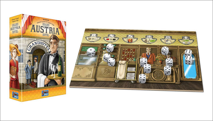
Great advice! And I can’t let you go without asking about your work on Grand Austria Hotel – it’s my favourite tabletop game and your artwork is a big part of its appeal. How was that project to work on?
Grand Austria Hotel had quite an interesting evolution. It started as Hostaria and was set in medieval Italy. The core dice mechanism was already there but the rest felt a little bit dry, so the designers reworked it completely and this resulted in the new theme. And illustrating a game set in my home country was a wonderful experience!
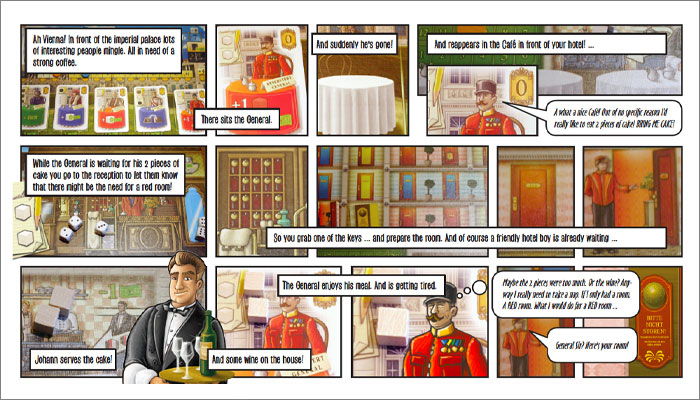
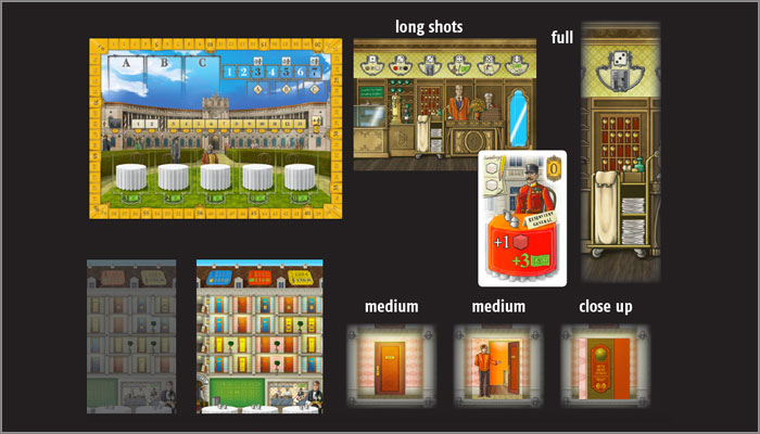
The great thing about the game from an illustration point of view is that many of the mechanisms – not all, but more than in most other Euro games – do make sense thematically. The sequence of actions tells a story, using different “camera angles”. I did create sort of a comic for a talk I held last year on visual design, which you can check out.
Brilliant, we’ll put that in here so readers can check that out. Thanks so much Klemens, this has been fun!
—-
To stay in the loop with the latest news, interviews and features from the world of toy and game design, sign up to our weekly newsletter here


