Art of Asmodee: Repos Production’s Tanguy Gréban on simplicity, variety and why constraints fuel creativity
Our Art of Asmodee series looks at how the various studios within Asmodee tackle art direction for their games.
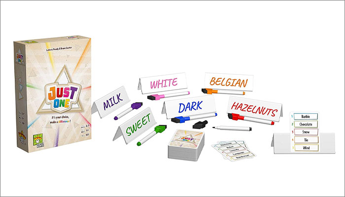
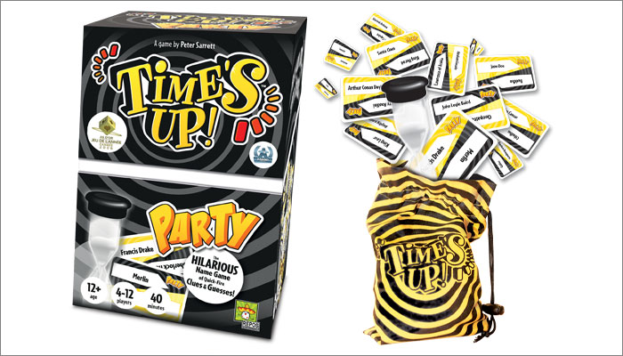
Today, we’re catching up with Repos Production, the studio within Asmodee responsible for games including Time’s Up, 7 Wonders, Concept, When I Dream and last year’s Spiel des Jahres winner, Just One.
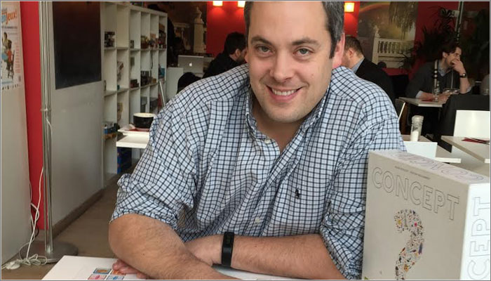
We caught up with Tanguy Gréban, Development and Publishing Director at Repos, to find out more about the firm’s approach to art direction, and what to do when confronted with a game that has no obvious theme.
How did you get started in the tabletop space?
Repos Production was created in 2004 by two game enthusiasts, Cédrick Caumont and Thomas Provoost. They created their company to publish one of their favourite games, Time’s Up, in French. The success started there and hasn’t left them for 15 years! The game was a commercial success but also a critical one; with numerous awards collected all over the world.
I met Thomas and Cédrick just before the launch of Repos, back when I was launching a game store with an associate. It was a store specialising in adult board games and which offered a unique choice of French versions of lots of new games.
We collaborated over the past 15 years and then, when Asmodee acquired Repos back in January, the company asked me if I wanted to join and to manage the development, the editing and the art direction.
It’s a very great honour and I didn’t think about my answer for very long!
How important would you say the art is to the success of a game?
This is an issue that has evolved a great deal over the past few years.
We come from a world where only the quality of the mechanics counts, but attracting consumers with a nice cover can be enough to sell a lot of boxes. That said, there are no miracles; it’s the quality of the game that dictates the durability of its success.
Given the current number of releases, three points are essential; attractive artwork to make people want to discover and own the game, efficient game design and ergonomics for quick and painless immersion and perfect game mechanics for great replayability.
Our goal is to release few games, but release games that last. As we work on games that are exported all over the world, it is particularly difficult to define what is “good artwork”. Tastes are very different even within a family, so when you look at the whole world, the notion of beautiful and ugly is very relative.
What guides your approach to working with artists and graphic designers?
We collect and create art books throughout the year and we follow what’s being done in animation, video games, comic books and of course, board games.
As our games require time and a large investment in terms of graphic research and testing, we also need to find professional illustrators who are reliable in terms of deadlines, who respect technical instructions and who are used to working with the constraints of our sector. In addition to these qualities and their talent, we also need them for their creative proposals and all that their universe can bring to the game.
With all these criteria, we go through the books, contact the artists who correspond best to the project’s universe, sometimes ask for tests and then choose the one we think is the best – if they’re available!
Is there any attempt to create a ‘Repos style’ that spans all your games?
The editorial line of Repos Production is “to have no editorial line”. We do not forbid anything. If the game is good and we do our job well, it has a chance of finding its audience. We can make mistakes and we can make bad choices; some can correct themselves or some cannot, and that can sink a game.
We do a creative job, but it’s also very technical and linked to specialised skills such as marketing and sales for hundreds of different markets. We learn every day and we adapt just as much.
In my opinion, you can’t do this job properly if you’re always doing the same thing. It may work for a few years, but at some point you have to evolve, even with a game that’s a huge success.
Some of your games haven’t got a obvious theme to guide the art style – I’m thinking of games like Just One, Concept and Time’s Up. With those kinds of games, where do you start when it comes to choosing the art direction?
These are the hardest games to create! They are a nightmare sometimes! Sometimes the idea comes quickly and all the other choices come from that first idea. Sometimes nothing goes right, you doubt everything and you get to situations where you no longer believe in the game or its potential. But with hard work and a lot of testing with a very varied audience, little by little, we manage to create a game that we hope will be the best possible. It’s time that allows us to see how we could have improved it.
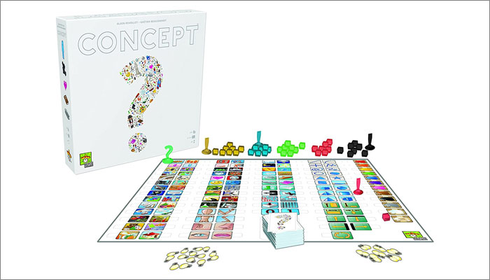
Let’s delve into one of your big hits – Concept. The game relies on many icons serving lots of different roles and functions so that players can convey almost anything with them. How did you decide which icons to include, and what made Éric Azagury and Cédric Chevalier a good fit to take care of the art for the project?
Concept is a game that required a lot of R&D and a lot of testing. Turning a game into a universal tool for image-based communication required a lot of work and Cédrick – who mainly supervised this project – knew that he would need an illustrator who would agree to redo his work as much as necessary.
The drawings had, above all, to be as understandable and efficient as possible. Simplicity is often what requires the most work and it is the basis of our game development work: simplify everything that can be simplified and remove everything that is not necessary.
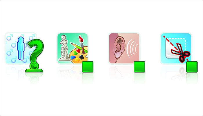
At Repos, we’re lucky to have graphic designers who are also artists and creators, and Eric took care of all this creative work. He also illustrated the Concept Kids Animals edition for children.
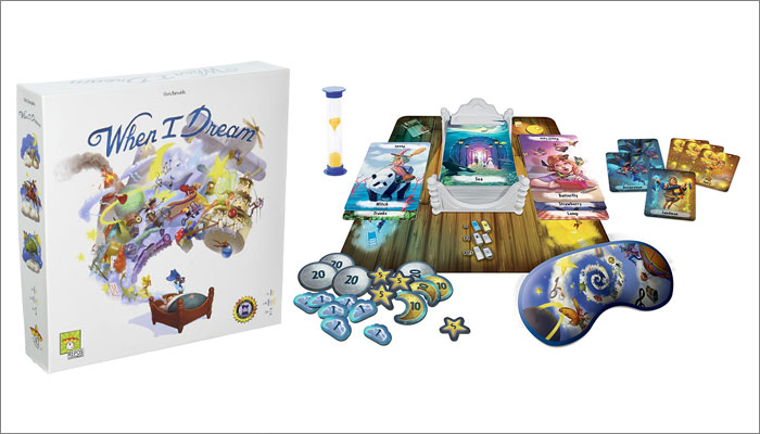
I’m also interested in the development process behind When I Dream – which is a personal favourite! You had 20 different artists work on the incredible dream cards in the game. Why was it important to incorporate a range of different styles for the project, and how did you choose who to be involved?
For When I Dream, that creative choice was inspired by a time constraint – and I think constraints are often the source of very good ideas.
Thomas and Cedrick were very enthusiastic about this game; it required little development and they wanted a dynamic approach that wouldn’t drag on for years. Given the massive amount of illustrations that had to be provided, they decided to divide it up between different illustrators and since the dream theme lends itself well to it, they decided to divide it up among a very large number of illustrators in order to have a wide variety of images and universes.
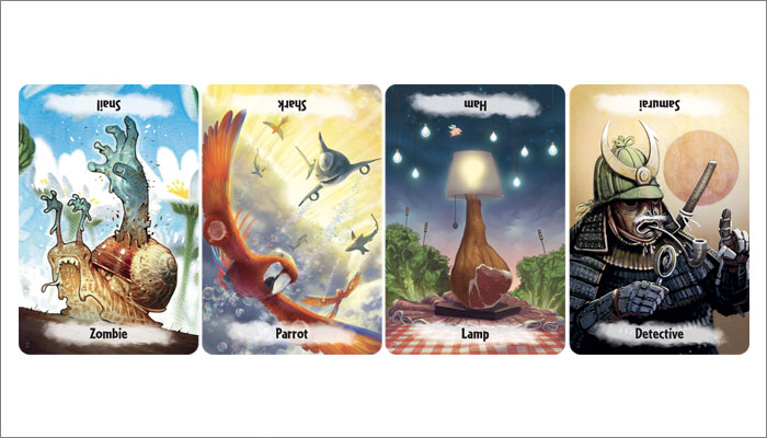
They contacted some of the best illustrators specialising in games and asked them if they could make a few cards according to their busy schedules. For an illustrator, it’s easier to free up time to create a few cards with a lot of freedom than to invest months into a game with a lot of “technical” constraints that are padlocked in at the briefing level.
For any artists or illustrators reading this and thinking ‘I’d love to work with these guys!’, what would you say is key to creating artwork for a Repos game?
We receive a lot of solicitations, but we only make a few games a year and we are quite loyal to our illustrators, especially if their work is a good fit with the universe of a new project. This means, unfortunately, we only have work for a few artists each year. That said, we look at everything that is proposed to us and we always answer.
The best approach is to create a web page with your work and send us the link. We don’t make any appointments at exhibitions as our time is entirely taken up by meeting designers and testing their prototypes.
If I could give one piece of advice it would be to diversify and make sure to deepen one’s art by going out of one’s comfort zone. I see a lot of illustrators who master perfectly a specific atmosphere or type of illustration, but who have not diversified enough. This is key as a game often requires variety in its illustrations.
Perspective, anatomy, composition, colour theory; mastering all the basics is essential.
It is also crucial, in my opinion, not to have images that are just “beautiful”; they must also be well constructed and very legible, especially as far as a game cover is concerned.
Finally, there has to be a respect for deadlines. Producing games in large quantities and in many languages is a complex process and our releases are always scheduled for selected events, so delays are not really an option.
—-
To stay in the loop with the latest news, interviews and features from the world of toy and game design, sign up to our weekly newsletter here


