Amanda Birkinshaw, co-inventor of Rubik’s Capture, discusses design, creativity and working with others
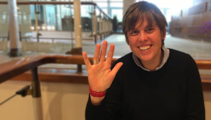
Hi Amanda! Thanks for joining us. Since this is your first time in the Mojo Nation chair, what were your favourite toys and games growing up?
Too many to mention, but I still have my set of Star Wars figures with Boba Fett – the one with the rocket glued in!
Non-lethal Boba Fett; noted…
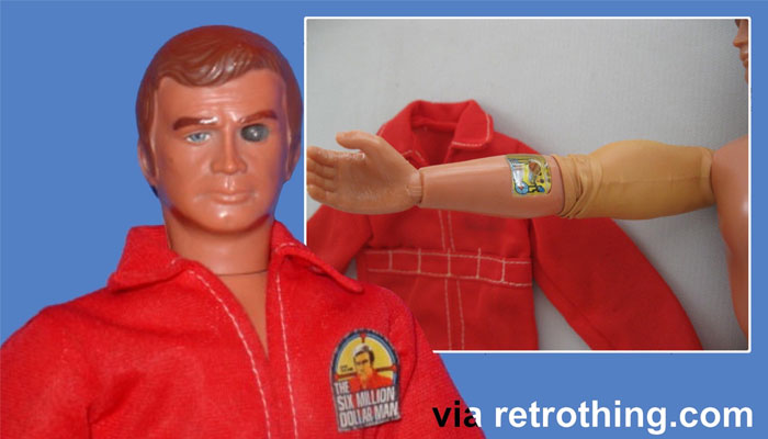
There was also a Six Million Dollar Man with the peel-back skin on the arm, and radio pack. Oh, and plenty of family sessions of Risk and Monopoly – my mum always won!
My mum always won Cluedo. I never played – my dad used to tell me I was Mr Body, and that I’d been found dead at the foot of the stairs. He sent me to wait in my room while they worked out who killed me… I digress, Amanda! What’s your background? How did you get into game design?
Before discovering you could design games for a living, I was an engineering product designer at Designworks. One day, Ben Rathbone – ex-Hasbro, now Spin Master – asked me to help playtest electronic Battleships, because I played games, was a bit logical and patient. Two weeks later, my career changed.
Oh, wow! I had no idea! So now, on your website – www.angelpie.co.uk – you say your endeavour is to hide the blood, sweat and tears and make a player smile and come back for more! I like that. You also mention teasing both your practical and creative mind! In what way? How are the two held in balance?
Game design works as the perfect blend. It’s like the swimming-swans analogy: above, you have the fun and story, but below all is all the hard work of function. A product becomes simply obvious to the player if you get that balance right.
Do you feel creativity is more art or science? And what do you do to stay creative?
Neither. Creativity is everywhere. I’ve not really thought about staying creative… If inspiration fails me, I go do absolutely anything else to not think about it – walking the dog, rowing, the allotment – and that elusive spark usually rocks up!
Great stuff! We really wanted to speak with you as part of a series of interviews on Rubik’s Capture. How would you describe that game?
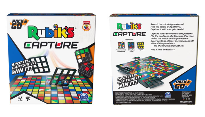
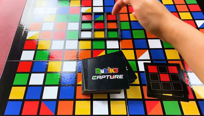
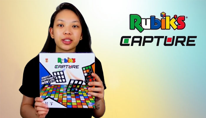
It’s a very simple find-it-fast game. You take a card, which shows a typical Rubik’s pattern of colour combinations… Everyone looks to find its match on a board made up of 14 x 14 coloured squares. First to spot it – and put their 9 x 9 Rubik’s grid on the board – captures the colours and wins the card. Unlike the Cube, it’s a genuine multiplayer game – everyone is playing, all the time.
A lovely summary, thank you! The fact everyone gets to play at once is a massive boon… So! You teamed up to work with Richard Heayes on this. What was his role? And what was yours?
Richard is a fabulous instigator and designer. He knows how to pitch concepts at that ‘easy-to-get’ level. We complement one another well in the initial phases of design. Putting together lots of ideas and having open conversations on the merits and fails. I usually end up making sure the gameplay is robust enough for production and draft the first working rules.
And from your perspective, what was the most tricky part of developing this?
Any chatty or presenting role. You know, you were there! Give me the ‘heads down’ product detail to do any day, every day!
I was there! And you know, Billy Langsworthy said to me at the time that we should interview you when Capture came out… Straight away, he was absolutely sure it would get to market! How did you address the practical challenges of the game?
For Rubik’s Capture, the initial concept had one board and set of cards, so it only had to work once. This soon expanded into a larger, standard board and a travel size board – oh, and did I mention they had to be double sided?
You did not!
This is why Richard does the talking! Rubik’s asked us to offer more boards; bigger – and double-sided. Our original board was 12 x 12, and we had one deck of cards – they wanted to increase the challenge… So finding a systematic set-up method of board and cards became key, while ensuring there wasn’t a colour bias, or any overall handed visual orientation. It was also tricky as sometimes colours had to be absent…
Colours had to be absent?
Yes – because reds and oranges in the Rubik’s palette are very close… So a board like that can easily look a bit ‘off’. And of course, we had to check that every card had at least one solution. The system worked and the ultimate effect is that the game looks fresh each time you play.
What’s the best thing about working with other people on a game?
The game will be better. A game is played by people, and often is the result of a studio collaborative of people. Considering other perspectives is important as it challenges every element: gameplay, physical properties, art, marketing, all the way through to retail. If you start with the premise that you want a game to sell over 10 million times, that’s a lot of people to make happy.
I love that answer! Love it. Well, in that vein, then, let me ask you this: if you had to give new inventors three tips to designing better games, what would they be?
In short: Test, Test, and Test. Play as much as possible, even playing ‘four hands’ on your own, gives you the information to improve.
When you say “playing ‘four hands’ on your own”, you mean what? Pretending to be two different players?
Four players! I usually play lots of rounds in average player mode, testing the number of players: two, three and four. Then I try and break things by playing as personality types using colours…
So wait, you’re pretending to be four people, with colours representing personalities?
Yes… Red is an aggressor – they’ll do absolutely anything to win, or mess up other players. Yellow is an average player. Green is a conciliator. They might assist other players, or make low-risk plays – like a parent figure. Finally, there’s blue… They’re competitive but fair; they make higher-risk plays.
Fantastic! That’s great!
You can also get gamers – people smarter than you – to break, stretch and bend the rules. Target groups for age grade and number of players. Write rules as soon as possible. Keep on noodling as you test. Always look for that ‘one little thing’ to make it better. Testing makes better games!
Amanda, this has been great. I honestly feel new inventors could read this one interview and immediately improve their ideas! Thank you so much for making time and giving us your insight. Final question: What’s the most interesting object in your office or on your desk?
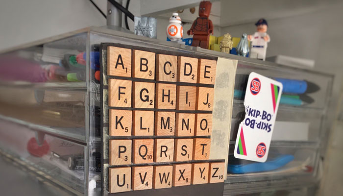
I have an alphabet of Scrabble tiles mounted to the wall. I never know which letter follows which without having to say it out loud or look it up.
–
To stay in the loop with the latest news, interviews and features from the world of toy and game design, sign up to our weekly newsletter here


