Game designer Brett J. Gilbert discusses putting a new spin on a classic in Labyrinth: Team Edition
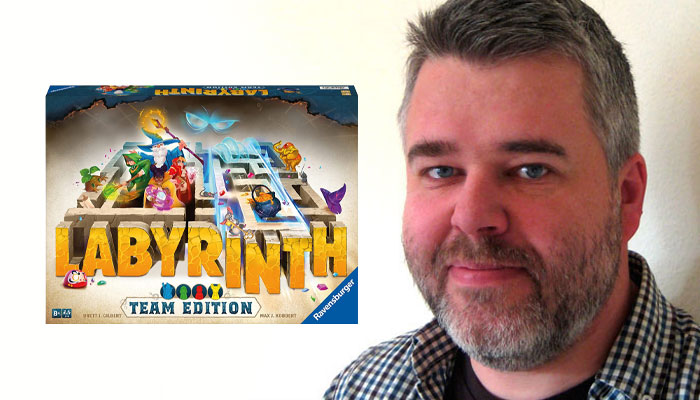
Brett, it’s always great to catch up. Let’s dive into Labyrinth: Team Edition… First off, did you have an affection for the core game prior to this project? Why do you think it’s endured?
I am not quite young enough to make the claim that we played Labyrinth as kids, but we found it later and always really enjoyed it. It’s an absolute classic, and a game that has earnt its effortless longevity – something it deserves simply by being really, really smart. The physicality of the shifting board, the clarity of the goal and gameplay, the interaction and surprise of it all. Such a gem!
How did this idea for a collaborative Labyrinth experience come about?
What’s surprising for a game with such a long history, is that a cooperative edition did not already exist. Perhaps the idea had been on the mind of its custodians at Ravensburger for some time, or perhaps the pandemic played a part in it, but either way I was really thrilled when Andre Maack at Ravensburger approached me with the idea.
We were into the second national lockdown in the UK, so you could say I had plenty of time on my hands. And what better project to work on than a cooperative game: that I could playtest myself while taking on the role of multiple players? Designing the game was a puzzle within a puzzle, ideal for a cooperative game and exactly my kind of thing.
I immediately spread out my own set of Labyrinth on the living room carpet, sat down and got to work.
Where there any key design challenges in crafting a co-op experience with this brand?
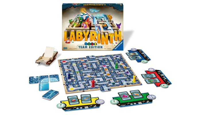
The primary challenge, as I saw it, was to look for a twist that could add something new to this incredibly familiar and well-loved experience, but without upending it entirely. Cooperative games need to provide the players with a lively opponent — an agent of chaos against which to battle, and against which they can attempt to emerge victorious. The labyrinth itself, then, had to come to life, and so Daedalus, the ‘mischievous spirit of the labyrinth’, was born.
Daedalus sounds like a name with meaning…
Classical scholars can pat themselves on the back for knowing that Daedalus was the creator of the OG labyrinth, built for King Minos to imprison his eponymous pet.
Ah! Nice reference! So Daedalus is here in the game to cause trouble.
Yes – but that wasn’t quite enough. Sure, Daedalus could potentially mess with the labyrinth by autonomously shifting rows or columns of tiles but, rather like the Minotaur, he needed a few more teeth.
A foundational tenet of good design, when confronted with a problem to solve within an existing framework and bounded by a set of existing components, is to look at what you already have and imagine new ways to use or repurpose those elements – before being tempted to introduce new ones. What aspect of these existing components has not yet been explored? The insight here was to answer that question quite literally: What was this unexplored aspect? The back of the tiles!
All I had to do was grant Daedalus — with his godlike, roguish, rule-breaking glee — the ability to flip tiles over, and this gave him all the power he needed to really get up in the players’ faces. The rest of the design work was battling to express this one idea as directly, as effectively, and as elegantly as possible.
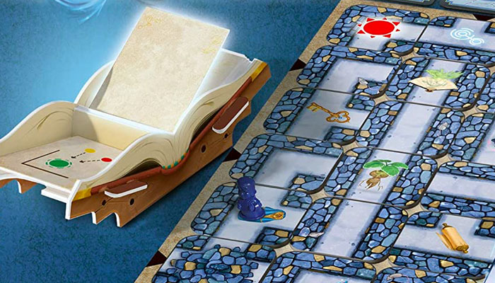
Players find out what Daedalus is going to do next by turning ‘pages’ – or flipping cards –from the Book of Daedalus, and what a lovely game component it is too! Did you always envision it to look this way?
I am delighted to say that I can claim credit for this idea, although it was only imagined in response to a query that emerged from Ravensburger’s own playtesting: namely that eager players would often forget to flip the next card in the deck and so miss out on what Daedalus was going to do next.
Other games have attempted to solve a similar problem by adding some totemic physical component that must be passed from player to player, and which signals whose turn it is. The additional insight here was to take that idea one step further and make the component into something that held the deck itself, and so literally presented the deck to each player in turn. This quickly evolved into reimagining the cards as the pages of a book, and this new component as the book itself.
I was even able to sketch out what the book could look like in 3D, and how it might be constructed from punchboard. The final design is pleasingly close to my original proposal. The genesis and development of this element is a fantastic example of how collaboration with a publisher can lead to a highly practical and physically delightful solution to an otherwise rather dry gameplay issue.
Absolutely, well done to you and the team on that. Looks beautiful. Before we let you go, is there anything else on the way from you that we should keep our eyes peeled for?
There are multiple exciting new projects in the pipeline, although I can’t say an awful lot about most of them just yet.
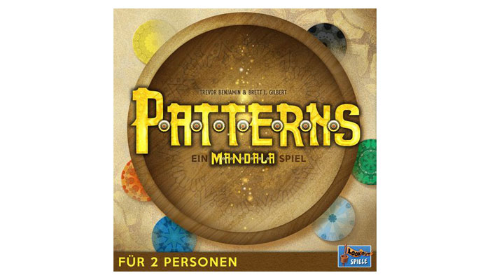
I am continuing to work feverishly with designer Trevor Benjamin – famed for his collaboration with David Thompson on the excellent War Chest and Undaunted series – on a bunch of different games. The first of which to break cover is Patterns from Lookout Spiele, a sequel of sorts to our “modern classic” – I am quoting other people! – Mandala. And, just like its big brother, Patterns will have a tea towel as a playmat. What more could one ask?
Looking further out, through 2023 and into 2024, there are new titles coming from AEG, Plan B, Edition Spielwiese, AMIGO Spiel and Space Cowboys, who will publish – whisper it – a follow up to Matt Dunstan’s and my Kennerspiel-nominated 2015 release Elysium. It’s been in the wind for many years and will, I believe, be thoroughly worth the wait!
We’ll keep our eyes peeled for that. Brett, as always, this has been a joy. Let’s tie-in again soon.
–
To stay in the loop with the latest news, interviews and features from the world of toy and game design, sign up to our weekly newsletter here


