Inside Out of Order – Part 5: Porridge Design founder, Helen Davies, on creating the game’s look
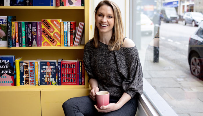
Helen, welcome. I appreciate you making time to do this as part of our tediously in-depth examination of getting a board game to market! I think this is part 400; I forget… So! As the founder of Porridge Design, what, generally, do you do?
I’m a creative problem solver – which is a fancy way of saying I make things look pretty! I work with a broad mix of clients, on a real variety of projects from branding and packaging to large-format printed elements such as store fronts or trade show stands. Ultimately, I love bringing my client’s visions to life!
And how did you come to be doing that; what’s your background?
Growing up, I loved anything creative. I think a career in design was always what I wanted to do… The exception was a short period of time I spent wanting to be a vet. That quickly dispelled when I realised how easily I faint in medical situations! So I funded my first laptop and all the creative software when I was 15 and went on to do a foundation year, then a degree in Graphic Design, where I specialised in packaging.
Oh, wow! Gosh – I’m always impressed when people know what they want to do that young! Did you immediately go freelance? Surely not?!
No, my career started in large branding and packaging agencies. I quickly made the transition to being self employed, though… I wanted to have a more direct relationship with clients and be involved with projects from brief to final delivery.
And in that respect, we met through your work in the toy-and-game industry. What kind of thing keeps you busy?
Until recently, my work in the toy-and-game industry has been solely for Gibsons and has spanned the last 12 years. You can imagine we’ve created quite a bit in that time! My first job was 221B Baker Street which feel likes a lifetime ago!
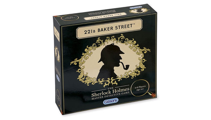
I can imagine! And was that when 221B Baker Street went from what I always thought was rather a sinister image of Holmes to the correct silhouette?
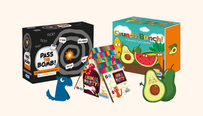
It went to a silhouette, yes… Was it a sinister image before? I can’t remember! Around that time, I also redesigned the core range blue boxes. In fact, we’ve actually done that twice now; with the introduction of the smaller boxes. I’m probably most proud of the creation of the Little Gibsons range, though, and all the products we’ve created for the younger generation!
The Little Gibsons range? These are children’s jigsaw puzzles?
Exactly. They have bright, colourful packaging; really enjoyable to work on… And I’m very proud of the feedback we received on those – both from the industry and customers.
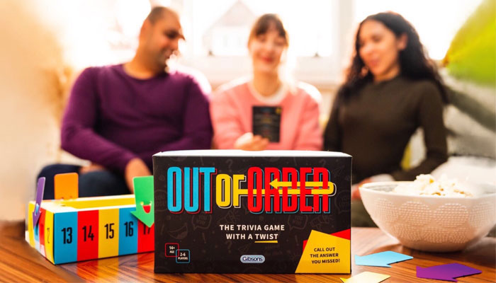
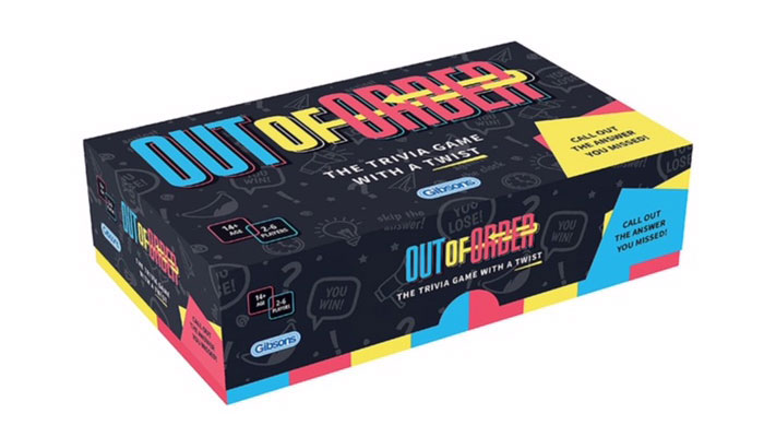
Interesting! And despite your featuring in a Mojo 100 list, you and I hadn’t spoken until you worked on a game put out by Gibsons: Out of Order. That had several different looks over its development… When it first came to your attention, what kind of shape was it in?
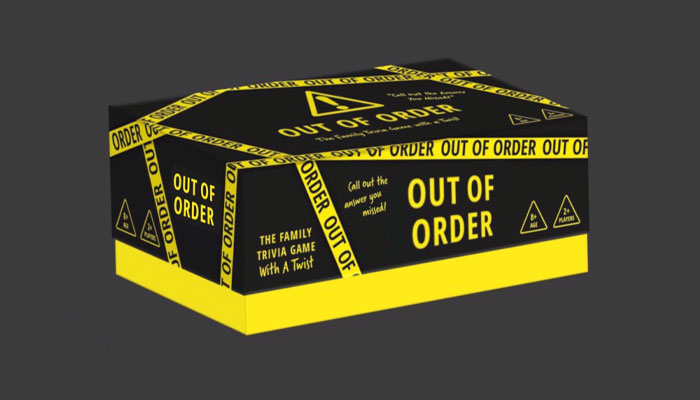
When Out of Order was briefed to me, it’d been suggested that we develop a concept based on black and yellow “out of order tape” which made sense based on the name…
This would’ve been very early days, then…
I imagined so because, at that stage, I was only able to see a couple of examples of the game questions. I hadn’t seen the rules… As I recall, the age rating and target market were still being discussed. So it wasn’t a huge amount to go on, but enough to start exploring the initial suggested concept.
And what did Gibsons ask you to do with it? How were you briefed? And by whom?
The “whom” was unusual because the project fell just as my usual contact, Emily Charles was going away on maternity leave. I was aware of the project before she left, but it was officially briefed and managed by her cover, Emma Kilby. Being in Scotland, I work remotely so the briefing followed the usual format: a combination of email and phone calls to discuss what was required, and to share the information that was available at the time.
And is that typical of the way your projects come about with Gibsons?
For Gibsons, yes, absolutely – although since working on this particular project, we now do a lot of the planning and brief writing through a workflow project-management system. It’s largely the same but it means all the assets are stored in one place and updates can be shared to multiple people at once.
And I’m curious, then: do you think the working relationships you establish affect the design of a product?
Personally, I think relationships massively affect everything in life… Systems and processes are really important, of course, but – in any scenario – people with great relationships are able to communicate most effectively. For me this is key: the better the communication, the better the end results.
Generally speaking, then, what causes poor communication?
Poor communication can be down to many things… The one that’s probably most difficult to navigate in my job is when the person responsible for gathering feedback from a wider audience relays it all back to me without reviewing or sense checking it.
Okay… You mean it’s just a lump of unfinished thinking?
Yes; often in that situation there can be conflicting requests… There can be things that we’ve perhaps already tried and didn’t work, or even things that are based on personal opinion rather than with a full understanding of the brief. This is not directly based on the experience with Out of Order, I must add!
No, no! I didn’t hear it that way. But I know what you mean… That personal opinion thing is a very sticky wicket. How do you avoid that sort of thing?
If I feel I’ve received feedback that might fall under this description, or just doesn’t quite sit right with me, I’ll query it. I won’t exactly pushback, but rather make sure that the direction we’re going in is definitely the right one. It saves time in the long run as – more often than not – if we discuss and debate things, we often agree on a different course of action.
What else do you do make sure communication’s successful?
I make a point – whenever I start a project – of ascertaining what communication method my clients are most comfortable with… So some I call on the phone, some I do everything on email with… Others prefer to use WhatsApp! The key thing, I think, is to communicate as frequently as possible – particularly when you’re working remotely.
Great stuff! Let me ask you this, Helen: where do you start with your creative process? You read the brief, obviously… But how do you then start envisioning packaging design?
Ohhh, that’s an excellent question!
Oh, thank you! We’re upping the stakes; we need an equally excellent answer!
Well… To be honest, it varies and depends on the the specific project and brief. Sometimes a brief is quite rigid – as when there are other products in a range that already exist. In that scenario, for example, my job would be to ensure we’re sympathetically creating something that works well as the “next in the range”.
Not a concern with Out of Order, presumably? We put that together imagining it would stand alone in the clearance bin at The Works…
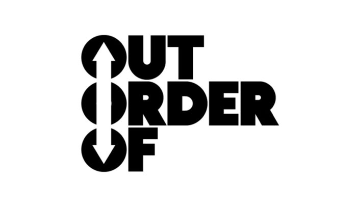
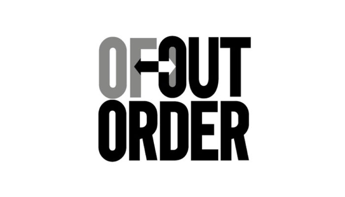
Ha! Oddly enough, that wasn’t in the brief! But no, in the case of Out of Order, the brief was more open and I was asked to create some different options. Initially, as I say, I explored the black and yellow ’out of order tape’ design while also working on about six different versions of the Out of Order logo.
And just so I can be clear, what’s happening for that? Are you using a pencil and pad? Walk us through your process!
In terms of process, again it can vary. I’m good at having ideas and almost sketching them in my head first… Then, if I think something might work, I tend to do a really rough sketch on whatever I happen to have in front of me! This probably applies more to logo and icon work, but is often useful with packaging too.
I do tend to create all my assets digitally using either elements from the products themselves or by developing supporting graphics from external sources or by working with another third party, which – with projects for Gibsons – would often be an illustrator.
Right… Sorry; I realise I steered you away from what you were saying! We were talking about the black and yellow ‘out of order tape’ concept… At some point, though, there seemed to be quite a big change of direction. Do you recall much about that? What happened?
Yes. The original brief suggested that tape concept, and I explored it and created mock ups of it. It was definitely a striking-looking design, but I believe it was felt that that black and yellow has inadvertently negative associations…
Negative associations? Oh! What, like a wasp? Or a bee?
Yes, or hazard signs… I guess it is a warning-colour system, so the decision was made to change the direction to something brighter and more friendly.
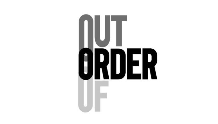
Interesting. With your permission, we’ll sling in a few of the black and white pictures of some other logo concepts here. In any case, while everything was coming together in terms of packaging, you also had the unenviable task of contributing to the final proof read… I often wonder about this: that’s not really your job, is it?! To what extent, then, do you feel you have to put yourself through that misery?
Another excellent question!
Oh, stop!
Well, these aren’t questions I usually get asked! I’d say that proofreading and design are quite different things…
But if you’ll forgive the double negative, you can’t not do it, can you?!
Naturally, I do often spot things and query them with my clients when I’m working on their designs. Ultimately, though, my job is to take the information provided to me and turn it into something which is easy to read and attractive to look at. When a project has a significant amount of copy to lay out, I’d view it all with a more helicopter perspective, to see how the line breaks fall and the copy looks within the space we have available.
This is exactly what I thought you’d say! I tend to warn people not to use designers as proofreaders. I use the analogy that designers tend to see words as if there’re pictures of words!
That makes sense, yes. And I’d always recommend copy being professionally reviewed by a copywriter – or word wizard as I like to call them! That’s because they’ll not only be well practised at spotting spelling or grammatical errors, but will also have suggestions for improving the tone, or ways to get a message across more succinctly.
Nevertheless, I think the first time we spoke we were discussing errors, and a few style choices. You were very accommodating; very on it…
Thank you! As I say, I do try – wherever I can – to review and spot things, and if I’m not sure something’s correct, or used consistently, I’d always query it, even if it turns out to have been something intentional.
Yes – and with Out of Order, of course, the questions had been written by three different people. And I think it was edited by at least two or three more as it went through the Diversity and Inclusion Team at Gibsons, so I think we were wise to communicate directly toward the end. And speaking of endings, Helen – we need to wrap this up! I’m sad to say that; I really enjoyed chatting. Let me finish by asking you this, what’s the one question I could or should’ve asked you that I couldn’t possibly know that I could or should’ve asked you?
Ohhhh I love this! It would have to be… Was it my favourite design of this project that ended up going to print?
Love it! Excellent question!
Ha!
Ha! I mean it, actually; that’s a great question… And what’s the answer?
In my job, I have folders full of stages of work that’ll never see the light of day. I’ve learned that, occasionally, the concepts I like best are not necessarily viewed in the same way by the client. I’d never share a design route with a client that I didn’t believe was right, or was meeting the brief, but yes – I do always have favourites! However, I’m afraid that these favourites will always only be known to myself!
Smashing answer! This is great… And if you think your client is outright making a mistake – which happens with my own clients when we discuss video scripts in particular – do you say something?
Oh, I’ll always say something if I feel a design is at risk of being spoilt by a “design by committee” approach, say, or if there are legibility issues with what’s being asked, or if I discover we’re inadvertently creating something too similar to an existing product… Any number of concerns. But other than that, I respect that the client has a vision and, ultimately, it’s my job to bring that to life in the best possible way!
Fantastic. Helen, thank you so much for your time and incredible insights. Terrifically interesting.
–
To stay in the loop with the latest news, interviews and features from the world of toy and game design, sign up to our weekly newsletter here


