“Keep it bold and simple”: Ryan Noonan – Art Director at GPI – on how games grab attention

Ryan, it’s great to connect! I’m always interested in how art directors enter the industry – what was your route in?
I came from a different industry completely – not a particularly inspiring one! – and left an old job I’d been at for over a decade since graduating college. I was stagnating creatively, hated what I was doing, and needed a completely new direction.
Since Hasbro is right up the road from our home in Rhode Island, and a good friend who worked there encouraged me to apply, it seemed like a good spot. I’ve never planned ahead in my career in any way and kinda just roll with the punches.
I entered there as a temp in 2012, worked under some really supportive people and was hired for a brand design manager position – aka Art Director – on the games team when I went full time a year later. It was a blast, and I owe a lot of folks there a lot. I’d never experienced that level of teamwork and creativity in my former job.
So, I definitely bloomed later than some other graphic designers.
Great stuff. I’m interested in the relationship between striking graphics and sales… How key is the art of a game to its potential success?
Man, I hear people ask that a lot, and it’s a tough one. There are so many titles out there now, and loads of them have really beautiful artwork featuring really diverse design and illustration styles… But there are other hugely successful games that succeed on the rep of the product itself, where promotion and word of mouth is the main driver – some of them in spite of the art. The anti-design look that’s still the foundation for a lot of mass market party games is a great example of that. There ain’t much art there but they sell like crazy.
To me, it comes down to standing out on the retail shelf. Don’t you wanna look different, at least different enough, to get some attention? A good designer brings that to the project. They’ll want your game to stand out. And that’s all on the artwork. Good design brings a level of craftsmanship to a game.
Great answer. You mentioned there about the amount of beautiful art that’s out there in the games space. Are we living in a bit of a golden age for board game art?
In some ways yes, but in other ways, I don’t think so. It depends a lot on the category you’re designing for.
The pre-school skill and action category, the adult party game category and a lot of traditional titles from the big publishers are sorely lacking in visual creativity… And I don’t think many designers consider that stuff artistic.
I’m not blaming the creatives necessarily… They’re under pressure from marketing and sales teams to make sure they don’t visually rock the boat on a proven commodity – and I get that – but if you’re talking strictly about the art, it’s pretty boring stuff.
So where are you seeing great art in games?
Well, look at a lot of smaller publishers’ products and WOW, does the artwork look amazing! It seems like any style is on the table, and that’s pretty exciting. So, if it’s a golden age, it’s down to the smaller publishers whose art has bled upward into the mass market, forcing larger companies to rethink tired formulas.
I spend a good amount of time in vintage and junk shops looking at design from decades past, and there are some pretty radical, badass visuals on game packages from the Sixties and Seventies; stuff that would never get past the sales teams now. So, if we’re in a golden age where companies think any idea can sell based on the pure quantity of games on the market, we’d better be careful. That’s usually when people get sloppy.
Can you talk us through some recent projects you’ve worked on, and dive into some key decisions behind the art direction?
Like I said earlier, almost all of the decisions on the design side have been based on making the product stand out on a retail shelf, or online, and immediately communicating the game idea to a consumer. We design quite a bit for big box stores like Target, Kohl’s, Walgreens, and so on, and the first thought is always: “How does this game look different than what it will sit next to?”
GPI did a project for Big G Creative last year called Ghosted, which features a big logo and title on the cover and little else. In that case, all the pressure was on the logo, which consists of a question mark – it’s a Whodunnit game – with a haunting figure built into the mark’s negative space.
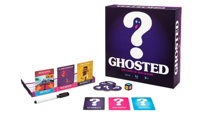
I was trying to communicate the idea with as few visuals as possible. Keep it bold and simple and odds are, it will stand out, like a street sign. This doesn’t work for every game category, but we found it to be a successful approach in this case. You can’t miss the Ghosted package in the family game part of the aisle, and I’m proud of that.
Absolutely – catches the eye for sure! If we delve into your creative process a little more, what do your first steps usually look like on a project?
Like I said before, a lot of times it’s: “What can I present to the client that looks new?” Can I find some artistic visual nuggets in another area of consumer design completely and find something you don’t see much in the board game world? Is there a colour that no other game in the category you’re designing for uses on their package? Does the shape of the box itself beg to be completely original? In most cases these days, when fitting into a planogram is everything, the answer is usually “No.”
So, to counter that, see if there are print effects that make the package look enticing enough to pick up. A lot of it is based on that question: “What makes someone want to pick this box up and place it on their game shelf at home for the next decade?”
Ryan, this has been great. Huge thanks for sharing your insights. I have one last question: How do you fuel your creativity?
Just sit down at your desk and get into it. Sketch, look for some inspiration from other industries – like album covers, sneakers, whatever gets you going – sketch some more, and just stay in it. The ideas get better the more you sketch and start moving things around on your screen and begin exploring other ideas. That’s it, really.
Sometimes you gotta get all the bad ideas out of your head until you find that one that hits. So, if you need to take a walk and get the blood flowing before you sit down to work, or get some music going, or have a Diet Coke, or do your designing at night, or do your sketching in a coffee shop… Do that! Creativity can go dormant if you’re not motivated, so you have to stoke it sometimes.
–
To stay in the loop with the latest news, interviews and features from the world of toy and game design, sign up to our weekly newsletter here


