The art of the sizzle video
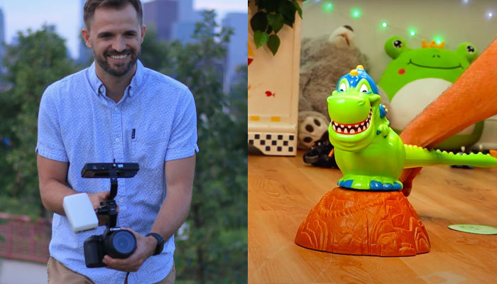
Curtis Varner – former video producer at Big Monster Toys – breaks down a few sizzle videos, highlighting key creative choices and their desired effects.
The sizzle video has become a staple in the toy industry.
Over the past 10 years, many companies have made it mandatory to make a video submission. From what I witnessed at BMT, Covid furthered that gap and changed most in-person meetings into virtual. The benefit – or curse? – is instead of having one big meeting with a client a year, you can have 10 smaller ones.
I was hired to help change the model of video submissions at BMT. The old standard was that a designer would upload a one-angle video – two to five minutes long – that went deep into mechanics… Pretty dry!
I tried to get away from this by making the content as hype as possible. When you see a toy or game on TV or online, it’s not a dull explanation of the toy… It’s, OMG, LOUD, SPARKLY – you know, hype!
I further realised that most toy reps at companies are marketing minded and basically just trying to figure out what they could sell to a kid or a parent. On average, they weren’t engineers or overly invested in mechanics. A huge part of my role was learning to interpret complex ideas from inventors and transforming that into something palatable and fun – like a commercial that you would see online.
In our video for Monopoly Scrabble, a major goal was to keep the length to 30 seconds or less. In my opinion, the point of a sizzle video is to entice the buyer… It’s the sales team who closes and explains the more intricate details. My goal was frequently to share the important things, but to not over explain.
This video also shows people having fun – a major selling point at BMT. I encouraged our actors – who were mostly designers and their kids – to be silly and ham up the entertainment of the game or toy. That doesn’t always come easy, but once you start making people dress up in wigs, muscle shirts and cowboy hats, it’s hard to take yourself too seriously.
BMT videos became synonymous with outlandish plots and generally people having a really fun time.
For our Spin-a-saurus sizzle video, my focus was on “call outs.” My bosses repeatedly encouraged me to hit the buyer over the head with the important information. For instance, the tail of the dinosaur is clearly a major selling point here, so I wanted the audience to know exactly how long it was: 16 inches.
I added a freeze frame and desaturated the background to drive home the feature even further. I learned to not assume that someone will understand even a simple feature; you have to make it as clear as possible.
My goals was to make two or three specific call outs for each video, which also helped to eliminate any fluff – or non-essential information.
It’s just as important to not highlight the fluff that you don’t want the audience to think about. I’ve heard stories about how people’s shirts, competitors’ toys in the background and even music choices affected the trajectory of a sales meeting. If you don’t want the audience to think about it, then don’t show it!
I hope these were some helpful thoughts on sizzles. If you’d like to reach out to discuss further, my email is [email protected] and my portfolio can be found at www.CSVproduction.com.
–
To stay in the loop with the latest news, interviews and features from the world of toy and game design, sign up to our weekly newsletter here


